22 August 2025
Український ринок цифрової розробки 2024
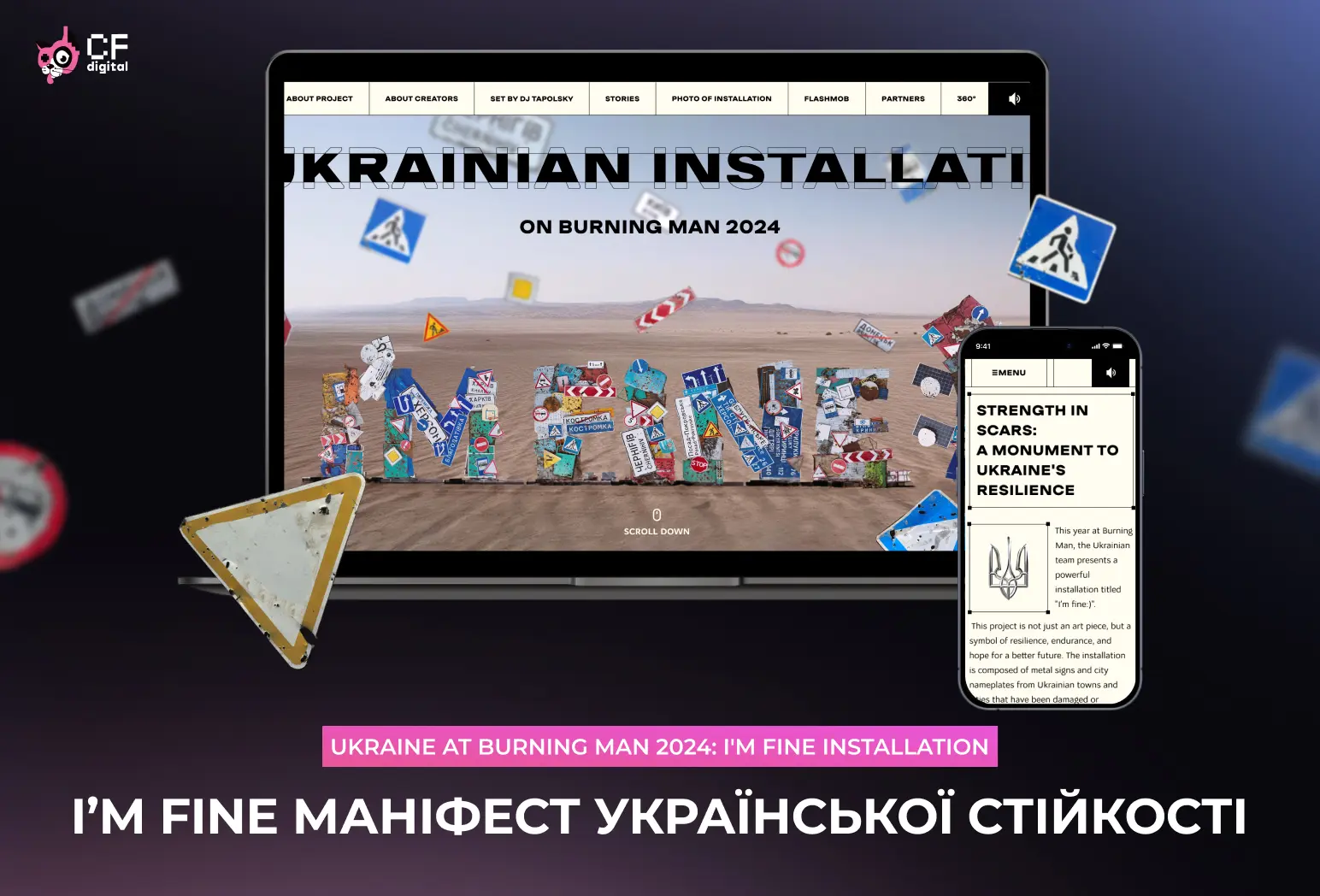
CF.Digital agency has rebranded its website with individual author's graphics and human-centred design approach. The product of the Digital Development department received a minimalist homepage, a dual navigation system, original asymmetric typography, flexible block structure of pages and many smooth micro-interactions with the user.
The website of a web development company should first of all have a portfolio. Case studies describing the goals, implementation strategy, technologies used, and the result obtained. Firstly, it is a kind of respect for clients. We, the developers, are the ones who can easily navigate our projects and technologies, but for people whose business is in the clothing trade or milk production, a website is something incomprehensible and complicated. Therefore, giving them at least brief information as a reference on what has been done and, most importantly, why it is done this way is useful and will help them in ordering their product. And secondly, it eliminates customer manipulation such as: ‘just make me the design of the main page, and then I'll decide whether to work with you or not, because I might not like it’!

We wanted to move away from the standardised presentation of websites in the digital sphere and implement a website with a WOW effect on all fronts. At the same time, it had to be simple enough to understand, understandable for any category of users and concise in the presentation of content. Let's be very frank: we did not set ourselves the task of sewing all possible digital technologies into the code of our site, turning it into the bride's relatives at the wedding, who put on all the most beautiful things at once :).

The colour palette of the website is based on two corporate colours: white and pink. White represents absolute freedom for new opportunities and experiments in the digital world, and pink in the site's architecture placed the main accents on the key structural elements. Since we are a team of creative oxymorons in the Ukrainian advertising world, this literary device is most often used in the texts of the case studies.

The website layout was implemented in accordance with the latest web design trends using top layout tools. Laconicism was the leitmotif of all front-end work on CF.Digital. We have completely moved away from prototyping gridded, directional blocks to highlight each element of the site, thereby focusing on its informational subtext and semantic content.

And a certain chaotic arrangement of blocks on the site's pages gives it creativity and demonstrates our individual style in website development.

At the end of 2016, C-Format agency, which has been sawing digital projects in the international and domestic markets for 15 years, began a rebranding process, as a result of which Creative format turned into CF.Digital, which has already managed to stick in the memory of colleagues with a pink and black cat with a digital ear and cool projects for luxury car brands.
The article was published on Sostav.ua