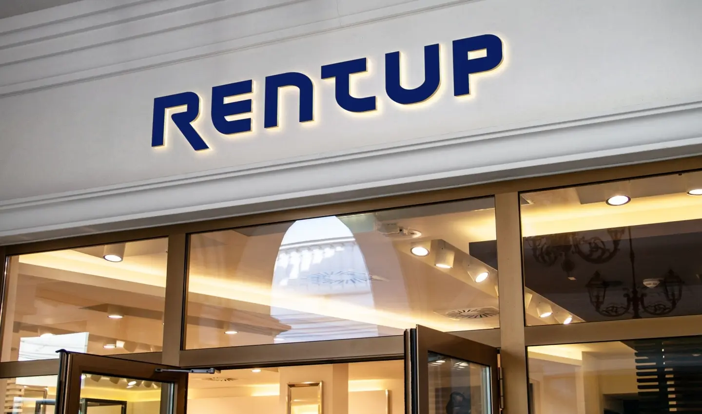
RENTUP IDENTITY OF THE INVESTMENT SERVICE BRAND
We developed the distinctive features of RentUP
At the time of enslaving mortgage, and total distrust of the banking system - a heavy burden of responsibility lay down on the shoulders of financial intellects. To find a brilliant way out of the hopeless gallery of procrastination on the real estate market is not an ordinary task, but they put up a good show.
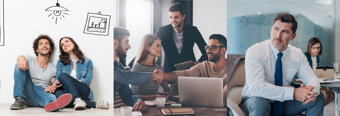
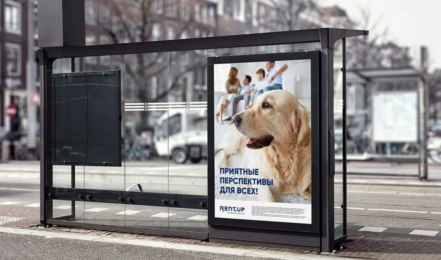
RentUp shows a perspective for people who have dreamed of their own homes for a long time. Thanks to unique solution, the Bermuda Triangle "investor-builder-consumer" miraculously transforms into the cornerstone of mutually beneficial cooperation between different social strata of the population, encouraging the whole country to hope for well-being.
"Original style for unique project" we thought and developed an identity for the investment service RentUP. We reviewed dozens of brandbooks of other projects, tried to find the hidden meaning in a hundred logos of other companies working in this industry, and analysed and analysed all the streams of visual information.
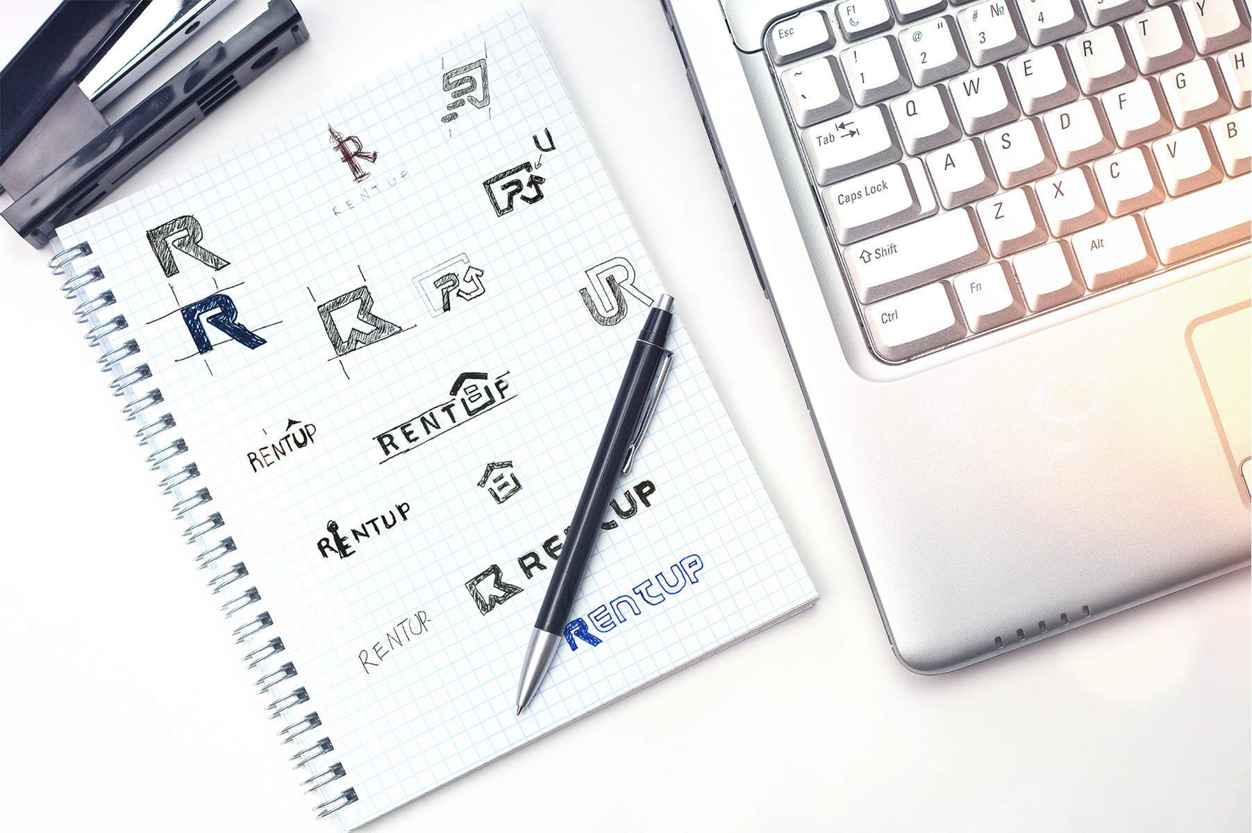
Were there any difficulties? We will tell you only the numbers, and you will judge by yourself :) We had 42 different versions of the name, 108 variants of the logo for RentUP, we spent 96 hours creating a brand book, 3 times our designers went into creative searches, and we spent 2 hours after work conducting the ideological brainstorm with colleagues.
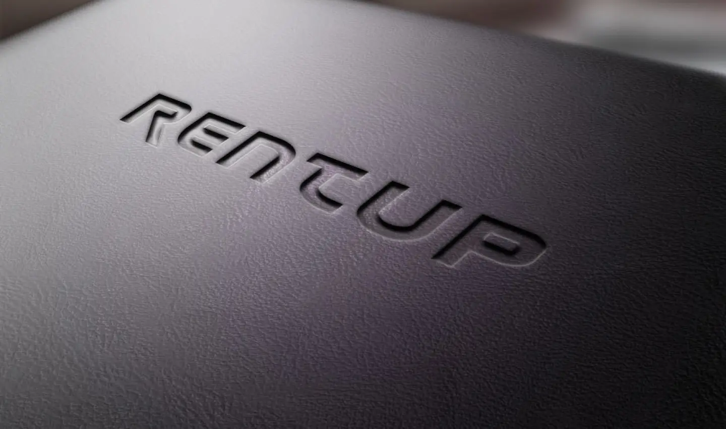
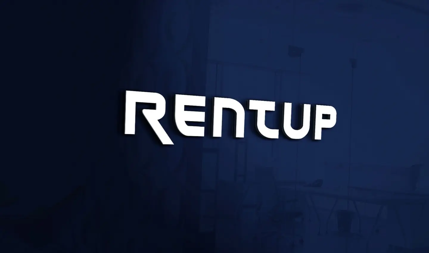
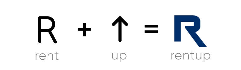
What is our result? All ingenious is simple. A new and clear laconic logo is easily remembered and remains in the memory of TA (results based on focus group survey). What have we done? We took "R" (Rent) and added to it ↑ (UP). Looking at the result, our team saw the solution of the problem that faced us - we got a logo that conveyed the unique essence of the project.
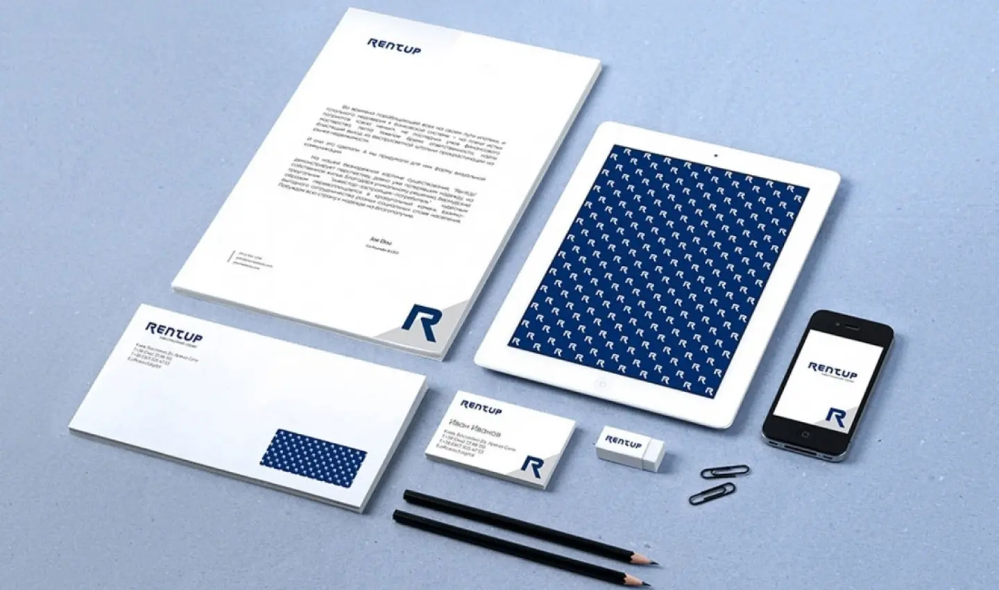
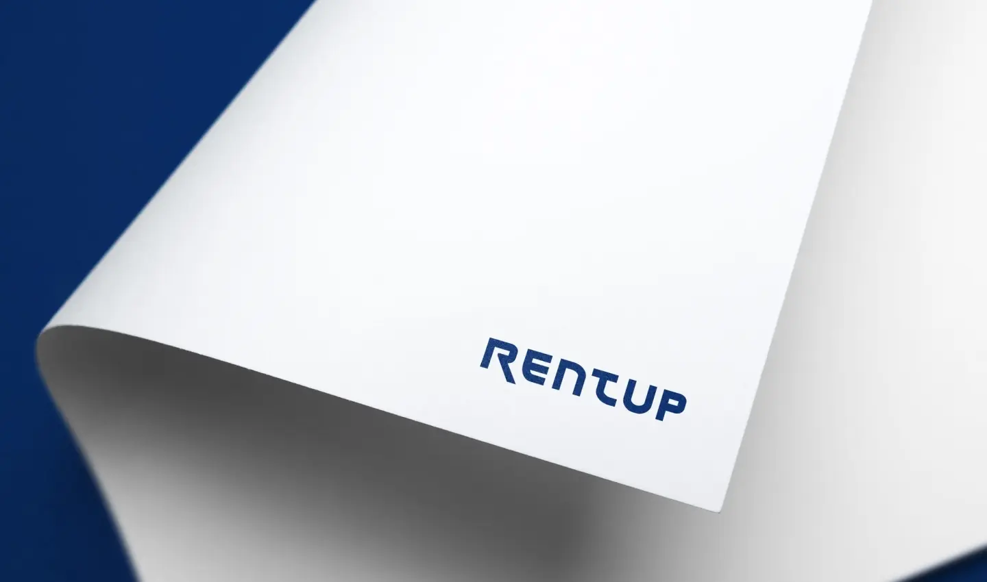
Conceptualism in the colour of the logo or mind games. According to the psychology of colour, blue symbolizes satisfaction and soothing contentment. Since there is a lot of total distrust in the sphere, in which the brand functions, so we decided to recreate the psychological style based on confidence, comfort, and satisfaction of all the desires of our client's TA. After all, RentUP allows you to have confidence in your future with your own home.
P.S. It's quite possible that a moderately quick creative solution of this issue, was inspired by the favourite song of our designer "Never Give Up" by Linkin Park!