Ptaha Brand identity
If it seems like someone is watching you, they are. These are little birds hiding in the words of the brand identity for the Ptaha brand.
Ptaha is a boutique atelier of author's tailoring and clothing repair. The atelier believes that: only one detail separates bad taste from the perfect image, since style is hidden in the little things.
This philosophy sunk into our soul, so we used it as the basis of the identity. That's how a single dot appeared in the Ptaha logo. This dot brought the birds to life in the letters. But as soon as one of them closes its eyes, it disappears.
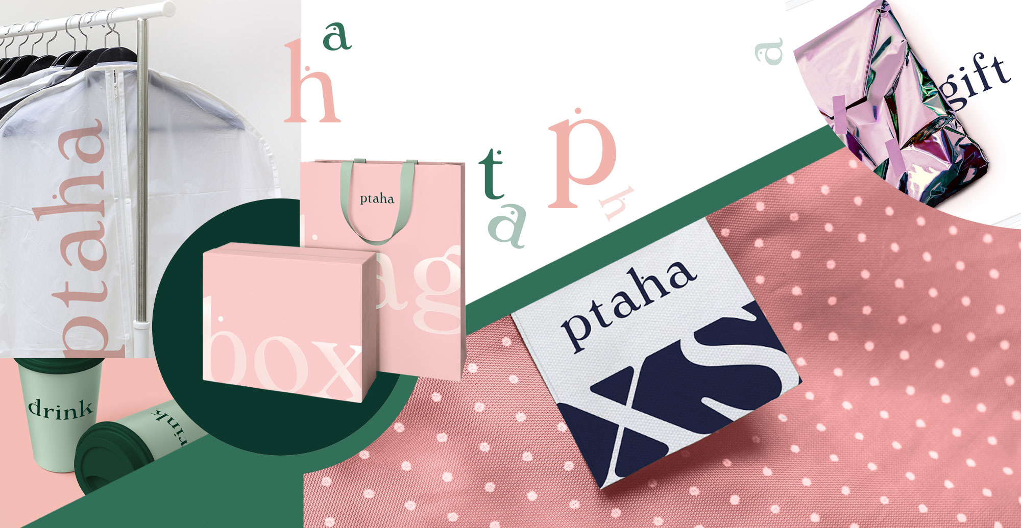
The birds become invisible, so they merge with the color of the background, which resembles a coniferous forest. This unusual shade for the atelier market is intended to separate Ptaha from its competitors. Meanwhile, the Windsor Antiqua font and pink color add the necessary tenderness to the identity.
It is important that the image of a bird can live in an infinite number of contexts: the bird can be brought to life by Marilyn Monroe's mole or the handle on an atelier door.
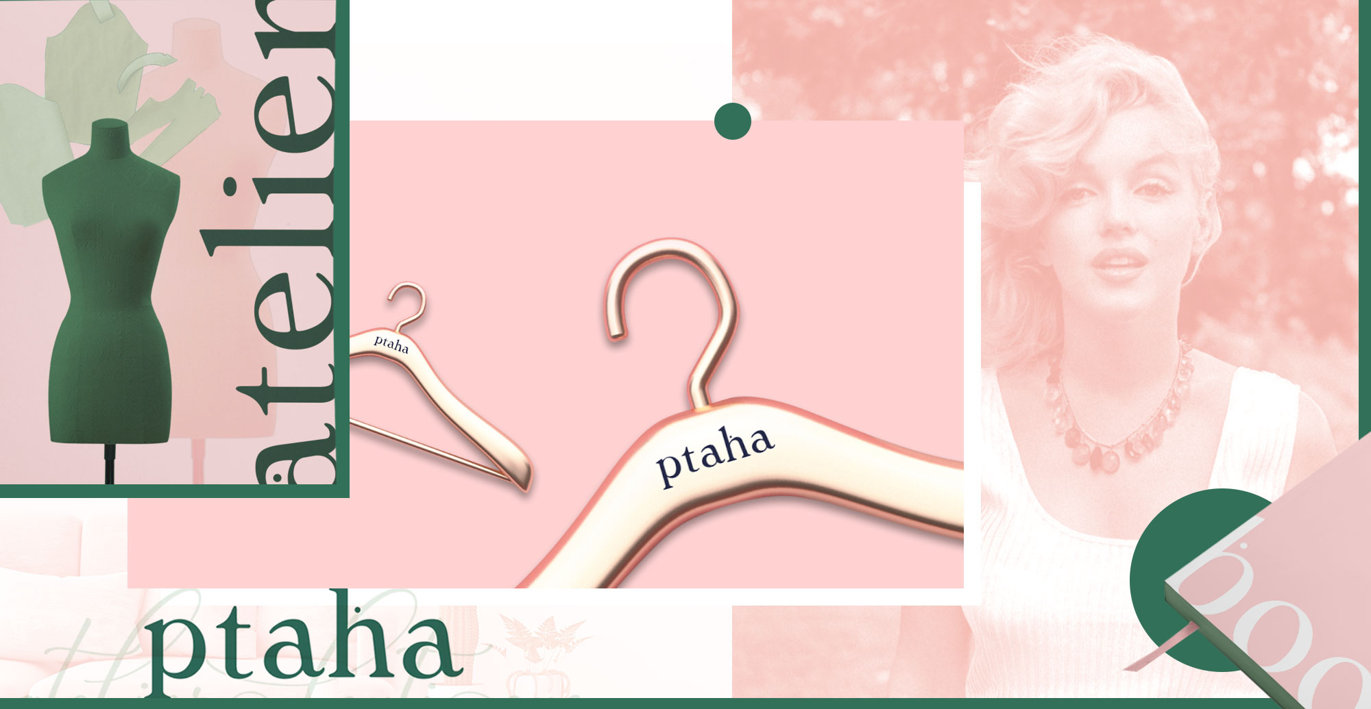
Now, wherever Ptaha appears, birds flock to it from everywhere. They sit in lines of words and sing about how CF.Digital breathed life into the brand with a single dot.