xleb XLEB is the bread modern history.
XLEB is a bakery branding that combines indigenous centuries-old traditions of baking art with contemporaneity.
The client wanted to get a flyer and a board, however, we created a new brand with an authentic identity. Why?
In a small, cozy bakery near Kyiv, centuries-old autochthonous traditions of baking bread on grape and rye leaven are preserved. Over the year, the bakery has formed a high-class, demanded product and has found its audience.
BUT: G.L.Bakery brand was NOT remembered by goodies connoisseurs at the name, identity and brand positioning level in the market. Nor was it related to the product itself. Of course, this is an obstacle to scalability and growth for the bakery.
Given that behind every author's recipe the legendary story lies, the importance of such kind of bread should be heard. That's how we understood our main mission - to transform a bakery into a brand that will combine centuries-old traditions and with the help of identity will convey its uniqueness. We decided to convert the an unrecognizable bakery with the “tree” logo (as consumers interpreted it, although in reality it is an almost cooked dough) to the brand that will be noticed and will convey history, combining authentic recipes and modern technologies.
Objective:
To convey the value of a brand’s unique unleavened bread using the identity system.
Everything old is new again
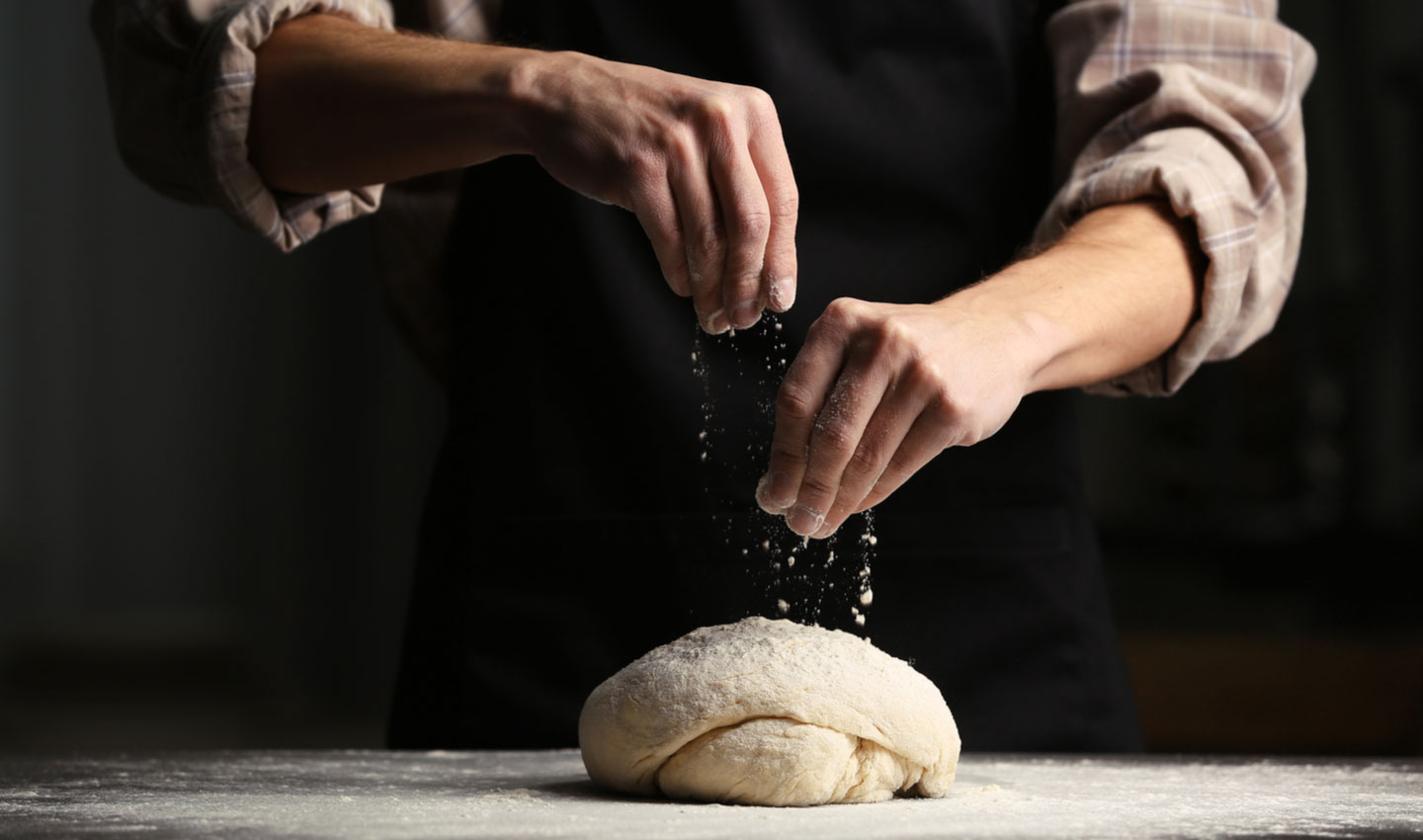
Since the bakery bakes bread on grape and rye sourdough, which is not typical for modern production, we have built the whole brand idea on the fact that this is a new modern product based on old recipes.
This bread is really unique. We checked it out on ourselves: we bought a lot of different items in different bakeries, but as a result, the bread was callous and moldy. We made sure that our bread confirms the original recipes of the bakery's founders. Then we dug deeper and began to explore the history of the bread itself. So we came to the origins of the "bread" history - to the proto-Slavic period. At this key moment, the idea of the history & modernity collaboration was born. Thus, Xleb came into being
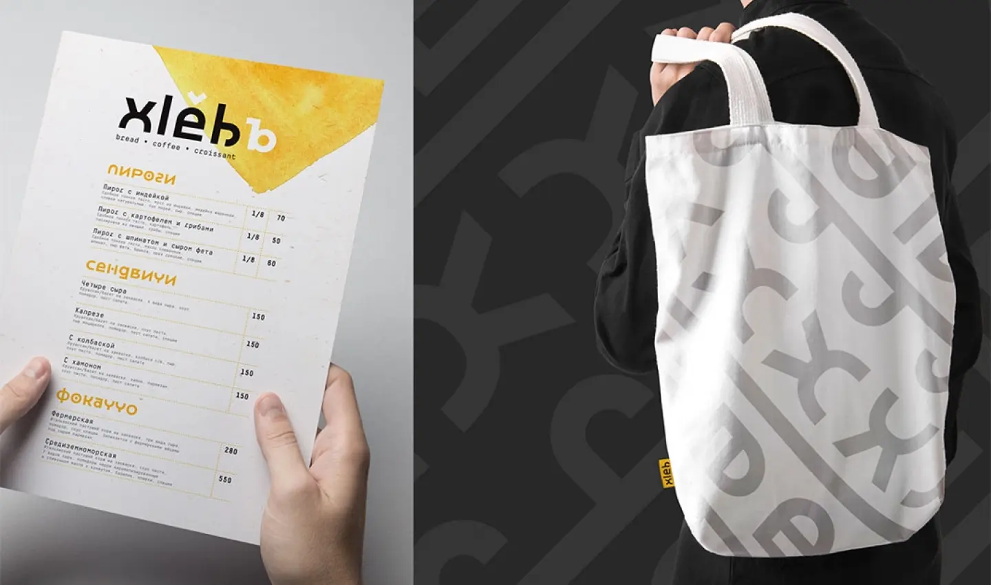
We created a brand identity and tone of voice around this idea. Appealing to the lexemes of our ancestors, the idea of identity was built around a text logo (the word Bread) written in the Proto-Slavic language (a reconstructed form of ethnic writing).
The full name of the brand: xlěbъ, adaptive - xlеb (characterized by the absence of ъ and writing Cyrillic e instead of ě). Since the logo contains symbols ě and ъ that are difficult to type in the Latin alphabet, they are displayed in the background and are decorative elements. Thus, with the help of a few letters, we conveyed the authentic value of bread lasting for thousands of years.
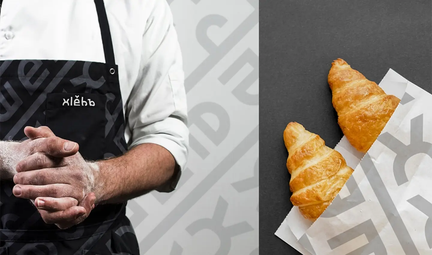
However, it is important to build a philosophy of the whole brand recognition not only with the help of the logo, but in a complex way. Only logo is certainly not enough. So we built the whole communication system: from packaging to social networks.
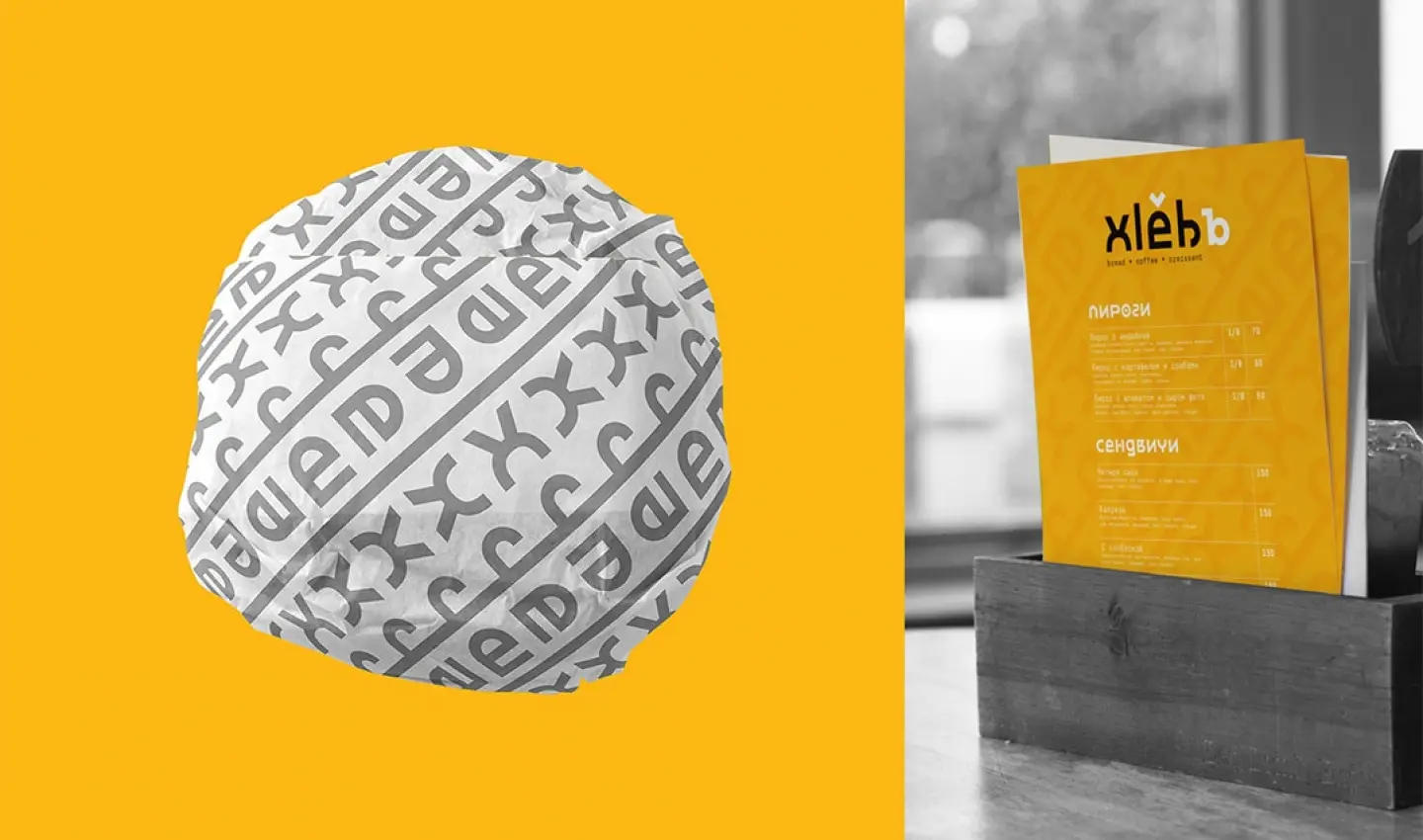
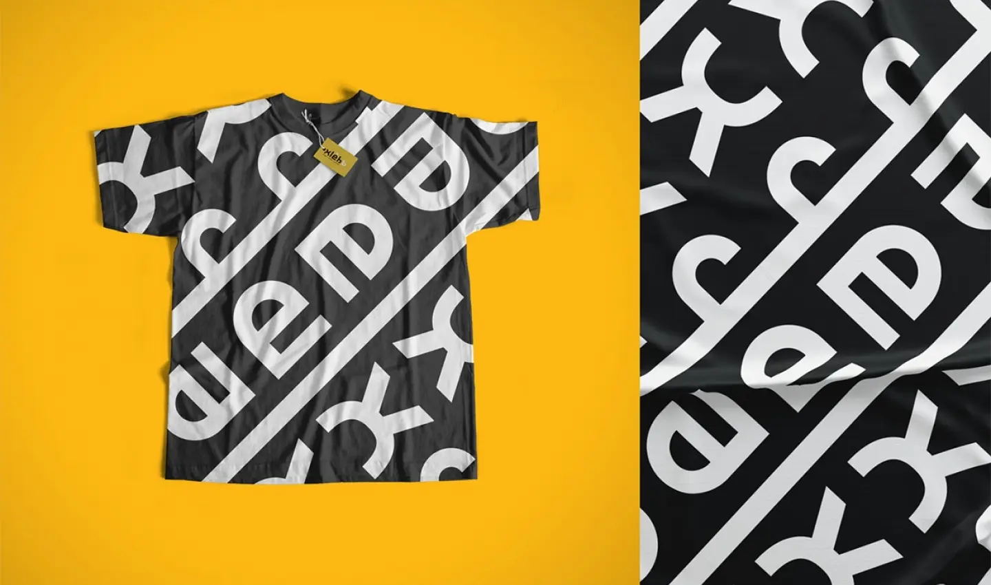
We decided to use seamless patterns based on the logo adaptive version. They will allow you to frame all the packaging and decor, in line with the Proto-Slavic household items. However, our patterns are based on modern graphics.
The communication system key is packaging. It was important to maintain brand awareness and philosophy even without using the logo. That is why it was decided to use the style of proto-Slavic writing and the ornaments style , especially those that were at the basis of the visual design during that period, in particular, various vessels, as the basis of identity.
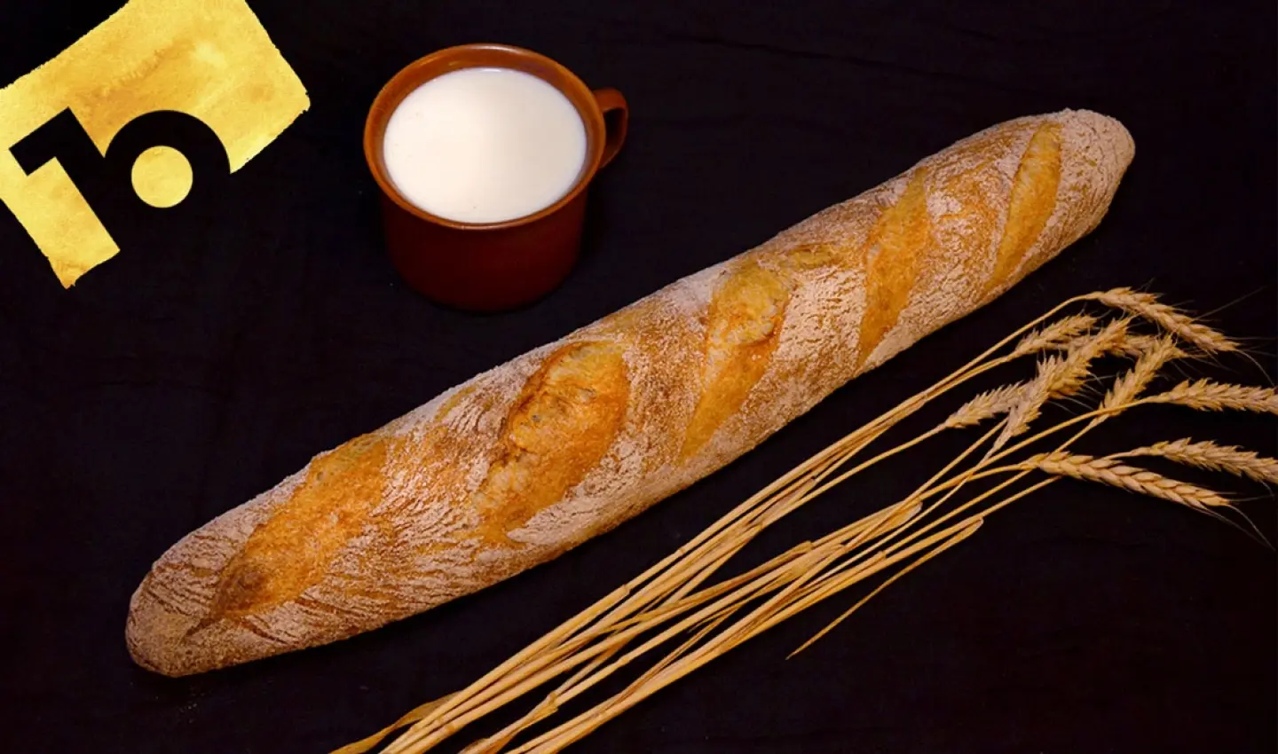
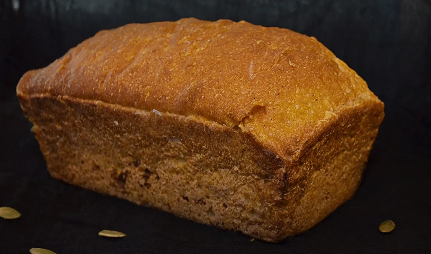
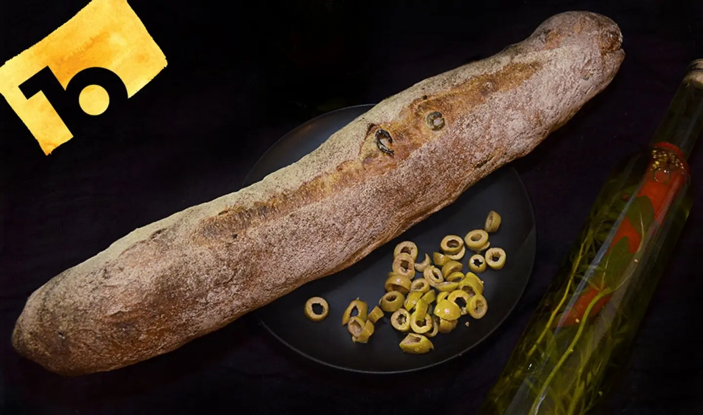
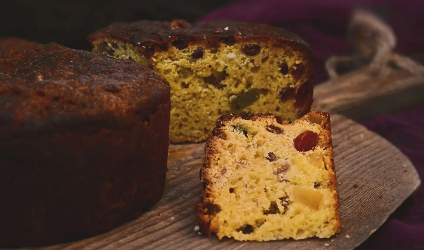
We have built the history of our bread through the message “This is a new, modern brand that produces a product based on bakery goods old recipes, but interspersed with the modern kitchen trends”. According to this Xleb brand positioning, we made a products' photoshoot in the “Dutch Still Life” genre, in order to further use the photo in outdoor advertising, SMM and on the website.
The syncretism of ethnic & modern is what we were able to capture in the photographs that convey the life of the product and the way of life, where the product embodies an addition to not only the meal, but also to the man lifestyle overall.
Compositions with soft light and rich contrasting elements conveyed the idea of a brand - a new modern product with "ethnic" roots!
 |  |
 |  |
WHAT DID WE DO?
Thus, thanks to the entire brand identity system development and its place in the market, we have built a new format of bright communication with the consumer. And this, in turn, clearly distinguished the Xleb brand from its competitors and accumulated the interest of the brand target audience. Besides, the social network's emotional tonality is already bringing new and new orders.
You want to taste Xleb over and over again!
 |  |
 |  |