17 February 2020
Irina Mushtina. Basic principles of LEAN approach in business

I'm going to start from a distance and give an example from the real world rather than digital. The reaction of people in society will be more clearly understood than click-through rates and bounce rates. We don't need a whole bunch of graphs and charts right now.
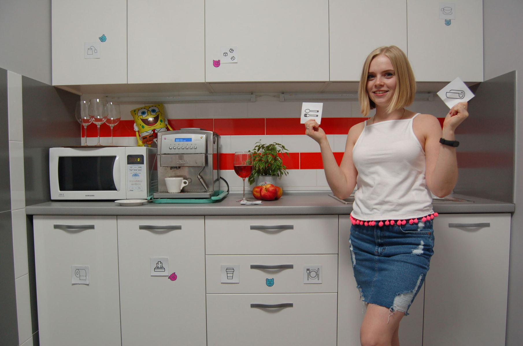
I conducted an experiment in our office, so to speak. We have a kitchen with white opaque drawers behind which there are a whole bunch of useful things, such as napkins, disposable tableware, tea, coffee, etc. But because the kitchen was not in order from the very beginning and everything was lying around as it was, everyone was looking in all the drawers in search of the right thing. And, of course, they were constantly asking everyone and each other about the location of the item behind the secret white door.
This article is not about anger management! It's okay :)
It's not difficult to repeat what is where to me or anyone else. But it's worth remembering that once you put it down, the sugar has moved again... and the search starts all over again. Here comes a brilliant answer - to make boxes with transparent walls ... But this is too easy a way to go!
After several iterations of searching, we came up with stickers with inscriptions for the most commonly used items. There were fewer questions and, strangely enough, things stopped moving chaotically around the drawers.
It would seem that the problem is solved!
But no. The questions did not disappear completely. After another search for disposable tableware, a counter, quite logical question appeared: “There are stickers on the doors that say what is where. Maybe it is not clearly written? “. The answer simply confused me and changed everything dramatically: “Well, you have to read it, it's easier to ask!”
Beng! Beng! Read... Here is the stumbling block!
And it turned out to be simple. Looking back, man, or rather a rational person, first drew and understood signs, and only much later learned to read. My point is that at the subconscious level, the human brain can process a picture or a schematic image faster and easier than text. No one writes “turn right” or “give way” on the road.
So it was decided to replace the inscriptions with pictures that schematically depict what lies behind the amazing white door.
One way or another, the problem of the eternal search is solved. (I hope)
I propose to take this story into the digital realm.
Users on the site, like my colleagues in the kitchen, are looking for an answer to their question.
If a person does not immediately understand where to find certain information on the site, they will ask questions. At best, on your site, and at worst, he will return to the search results and ask Google. And then it's not a given that he will get to your site for a clarifying query. And so you have already lost part of your audience.
Just like the pictures on the doors in our kitchen, pictures in product categories can also play a role. Have you seen the small schematic icons next to the category section? They look like this:
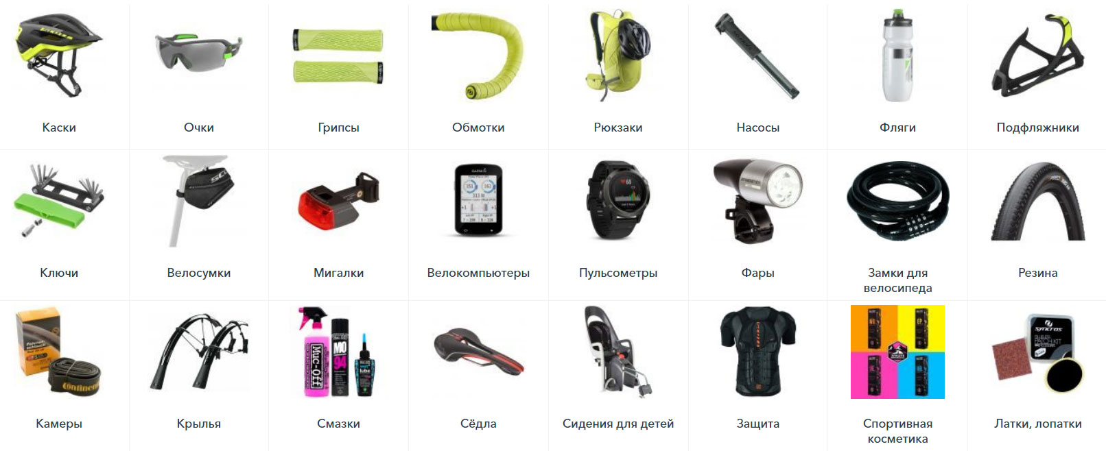
You don't even have to read the name of the category and everything is clear.
In my example with my colleagues, the visual component and the exact location of certain things are important. Similarly, on a website, if everything is laid out clearly, nothing is hidden, then the user will perform the target action.
Often, the first way to build the right structure is a well-clustered semantic core. Do not neglect it when developing a website! After all, users come to the site using certain queries for which it is optimized. Based on such queries, the SS is formed and phrases from it are grouped logically. These groups of words, united by their meaning, are distributed across the pages.
A few important steps of a good structure:
⦁ Write down all your product or service groups.
⦁ Write down the categories and subcategories of your site in a tree. You need to do this logically, without being strongly influenced by the structure of your competitors' sites.
⦁ Assume that you can still add and expand.
⦁ Then imagine the structure as a regular user and assume which way you would go. What would you want to see at a glance, without digging through the menu items.
⦁ After that, you need to collect the semantic core based on such groups. When collecting the SQ, there may be more items or some of them may be merged.
⦁ After clustering, you need to look at the resulting structure again to make it clear.
⦁ When all the points are ready, you need to arrange them in order, first the highest priority (goods or services) for the business, and then the lower priority and informational ones.
You shouldn't overcomplicate the structure and make a lot of points and sub-points, as the user will not want to search for a long time. As in my case, not everyone wanted to read the stickers. It is also undesirable to make categories of different content, leaving 2 sub-items in one and 15 in the other.
There are many factors that influence the choice on the site. But if you make it easy for the user to visually search the site from the very beginning, you will be one step ahead.
To summarize. For a website to be understandable for a user, especially a human, it needs to be simple. And sorry for the tautology - understandable!
Lena Zhgutova, SEO specialist at CF.Digital
The material was published on Sostav.ua
Other interesting news<i></i>