22 August 2025
Український ринок цифрової розробки 2024

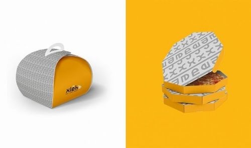
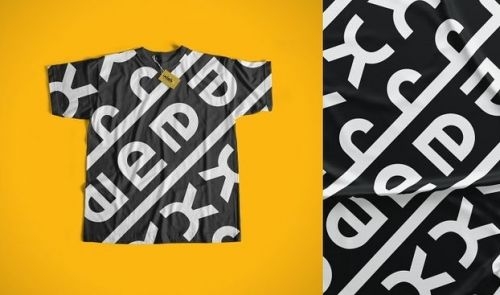
"We built the branding idea around the text logo of the word Bread written in the Old Slavonic language, referring to the lexemes of our ancestors. The full name of the brand is: xlěbъ, and the adaptive name is xléb. Since the logo contains the Latin characters ě and ъ, which are difficult to type, they are relegated to the background and serve as decorative elements. Thus, with the help of a few letters, we have conveyed the value of bread lasting for millennia," comments Pylyp Bilyansky, Creative Director of CF.Digital.
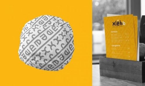
It was important for the agency to maintain brand recognition and philosophy even without using a logo. That's why the team decided to use the style of the Proto-Slavic script and the style of ornaments that were the basis of the visual design of that period, in particular, various vessels, as the basis of the identity.When developing visual communication, the team used seamless patterns based on the adaptive version of the logo. They made it possible to design all the packaging and decor by analogy with the Proto-Slavic household items.
"We built the story of the bread on the message: “This is a new, modern brand that produces a product based on old bakery recipes, but with a touch of modern cuisine trends.” In line with this positioning of the Khleb brand, we took photos of the products in the Dutch still life genre to use them in outdoor advertising, SMM, and on the website," says Iryna Mushtina, Founder & CEO of CF.Digital.
The article was published on mmr.ua