Pragnum Identity and website development for a law firm
Pragnum – courage vs. conservatism.
What does a law firm look like in your imagination? And what does a law firm look like in the world of brands?
We bet that 99% of the time, this association is linked with something standard, restrained, classic, and even boring. This makes sense, as the work of these serious individuals hardly intersects with entertainment or playful engagement with their audiences. By the very nature of their field, they need to convey expertise and reliability in both their work and their communications.
Task
We were approached by the law firm Pragnum with a desire to renew their presence in the digital space and a request to update their website. However, after evaluating the project, we came to the conclusion that it did not make sense to start the development with the existing identity.
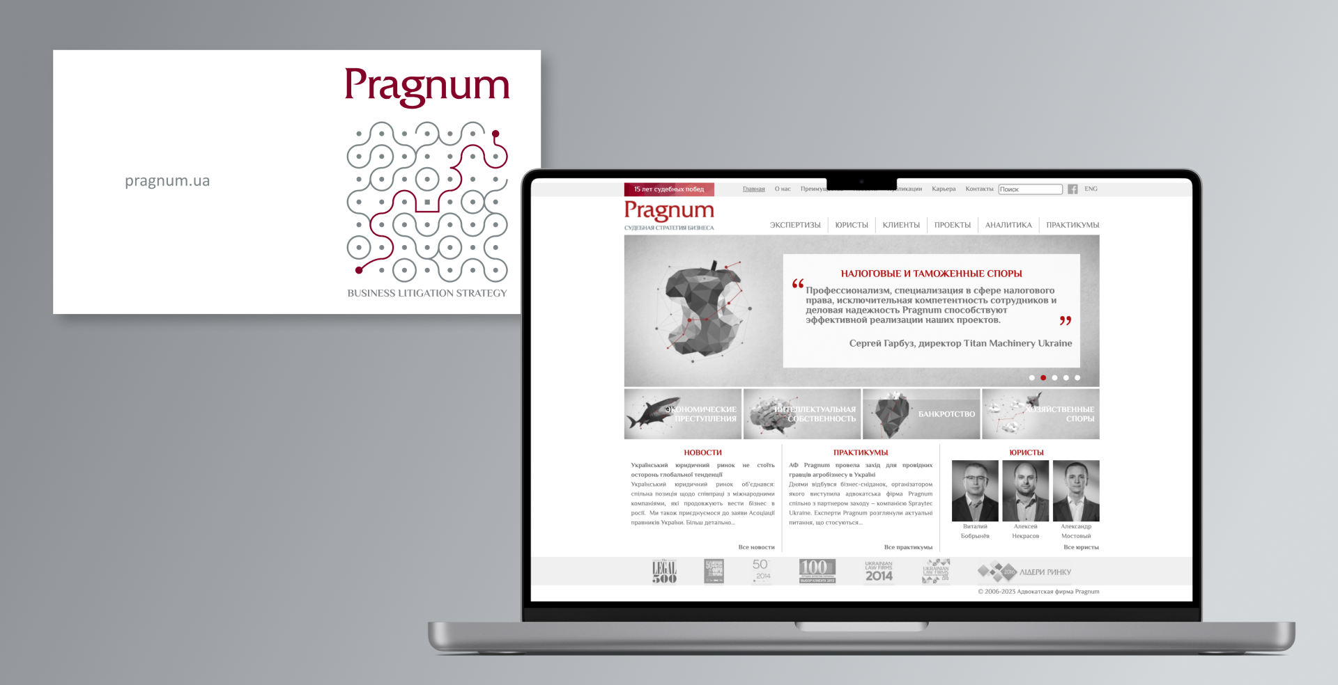
What was before?
The visual style and look of the website was very classic. The logo was quite complex to understand and embodied the practice of law: a multitude of options and complexities, sometimes obscured solutions on the way to overcoming obstacles. However, it did not at all illustrate the mission and idea of the company.
We decided to start by updating the positioning and creating an identity that fully reflected the client's strengths and values, evoked clear associations and was memorable to the audience.
Naturally, we started with a competitive analysis to understand what drives the legal communications market. After analysing several companies, we concluded that
a) Most companies are similar
b) Few have a distinctive style and memorable communications
c) The market tends to be heavy, technical and conservative
d) Logos and positioning are often chosen to be too complex and incomprehensible (probably not only to the user).
The digital niche in the direction of boredom and conservatism was already crowded with our client's competitors. Fortunately, we had no choice but to take our favourite route - one of boldness and audacity, especially as it perfectly matched the character and ambitions of the Pragnum team.
Our task was to convey the company's values to the audience as vividly and accurately as possible, so that they would resonate at a subconscious level. Of course, to differentiate Pragnum from the grey mass of competitors, to create a memorable image and to facilitate future communication with the target audience.
Solution
We conducted a survey among Pragnum's clients - these are quite serious and large cases, and our team relied not on a quantitative interview format but on a qualitative one, specifically to find insights. Some clients gave us a definition of the company, which led us to an idea that was eventually approved by the owner. One of the distinctive features of the company is that they go all the way with their clients and share their victories with them, are as involved as possible in each case and enjoy the process. Having held more than one meeting with the client to understand more about the mood, approach, and personality of the brand, we managed to derive a key idea that was reflected in the identity.
We turned to the Eastern philosophy of samurai warriors who are 100% dedicated to their craft. And it clicked - the owner is personally interested in Eastern wisdom and this approach resonated with him. After strategic meetings, brainstorming and extracting as much information as possible from the owner about his business, we came up with the final brand concept:
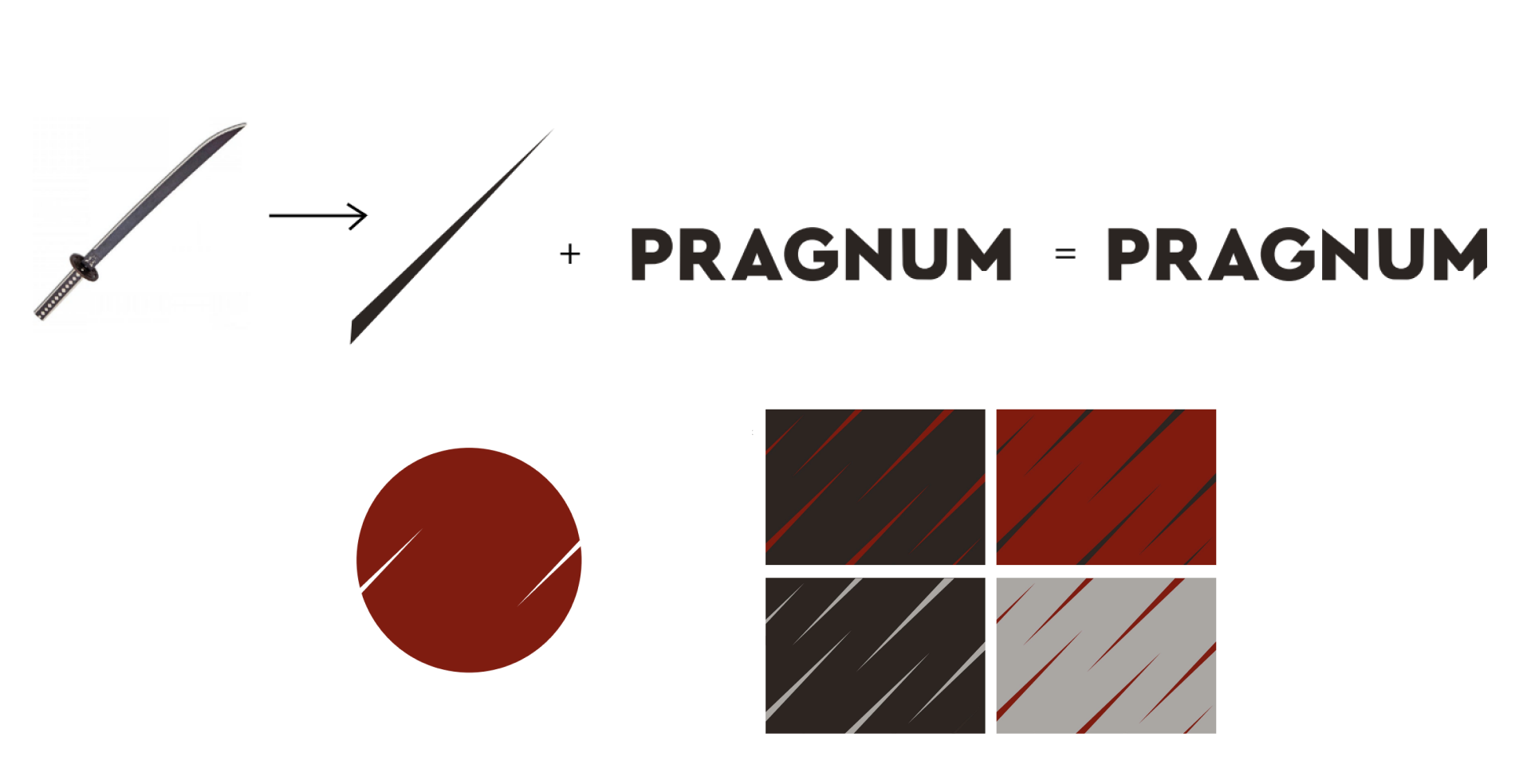
PRAGNUM - Samurai warriors, principled and skilled in winning by taking risks.
Japanese motifs in the concept provide an unusual image for a legal subject, attracting attention and standing out among others.
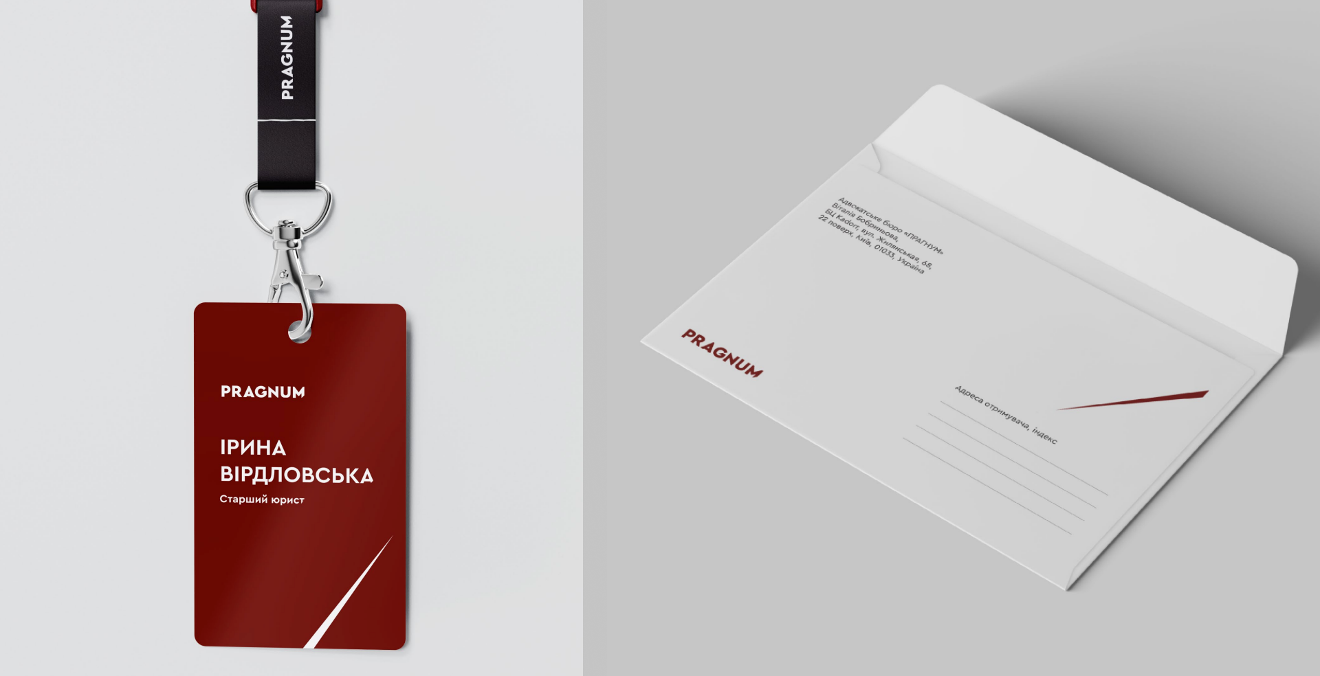
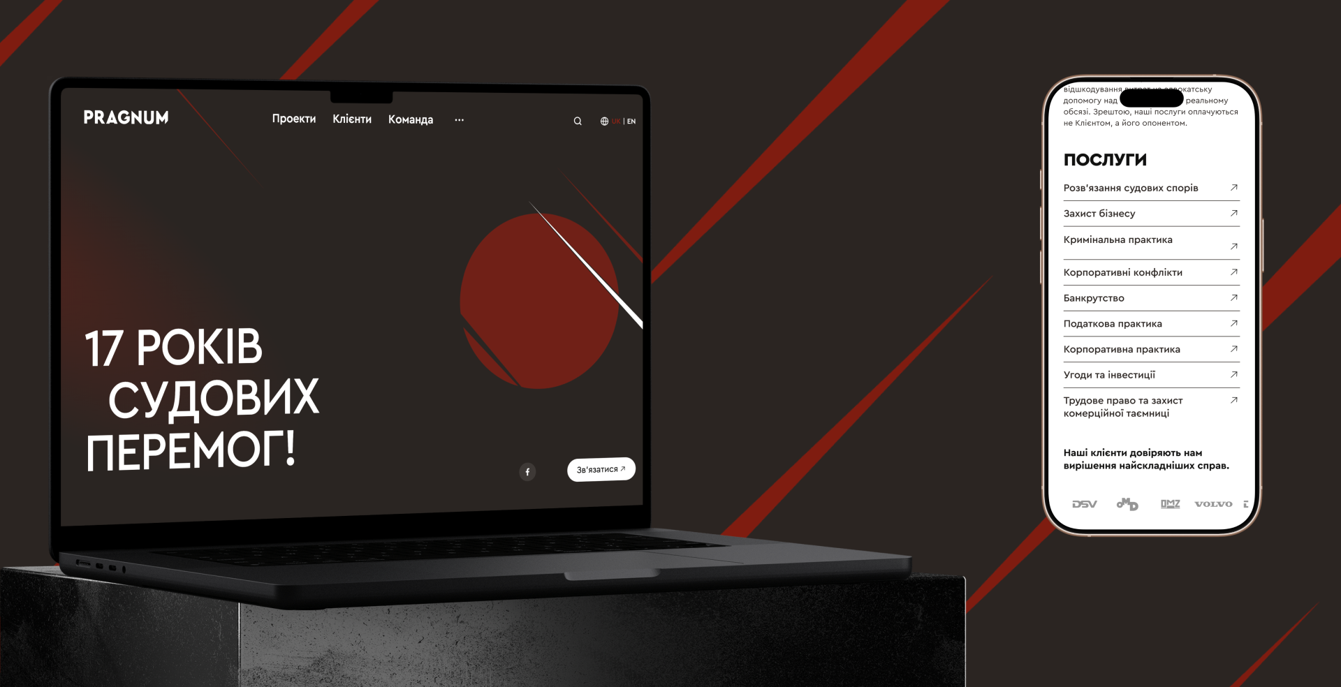
Of course, we couldn't visualise this idea directly with a Japanese samurai. Instead, we chose a katana that cuts through a circle, leaving a sharp edge. We emphasised the symbolic significance of samurai warrior culture, intellectual sharpness and decisiveness as Pragnum's main assets.
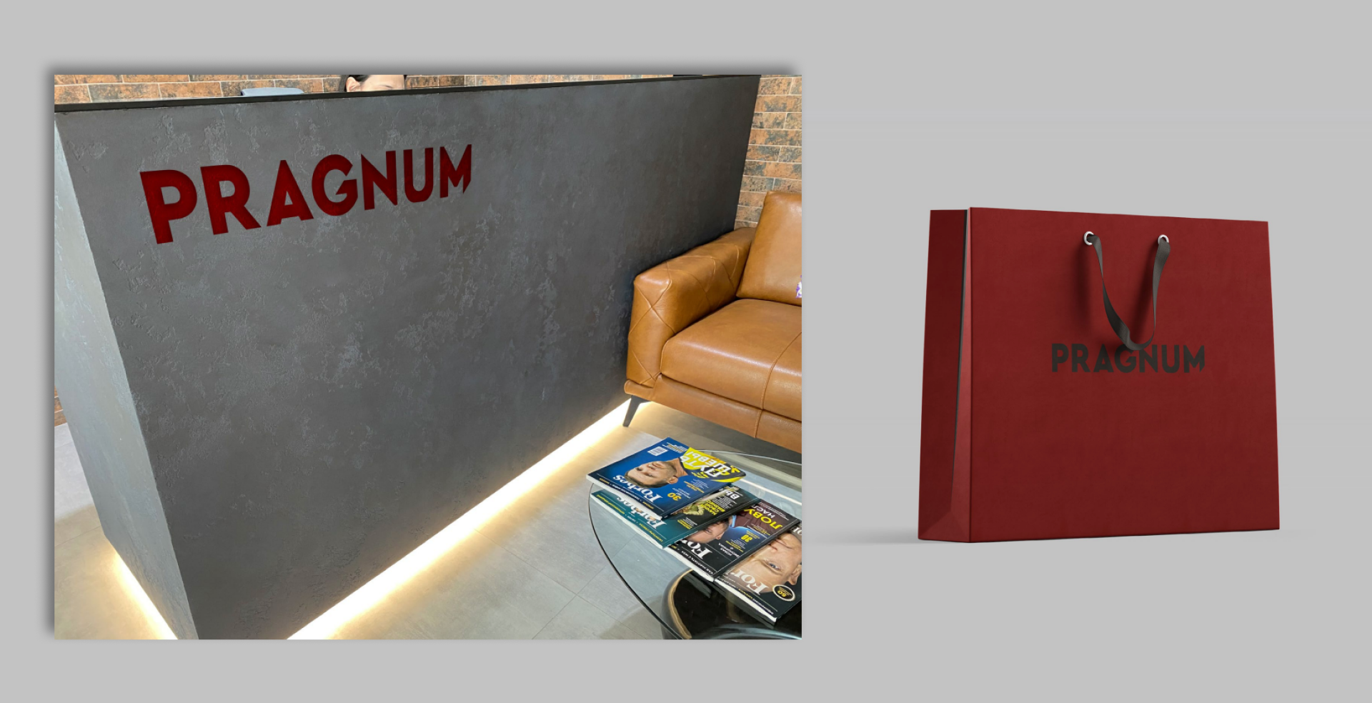
We chose contrasting colours of almost equal saturation: red and grey, graphite. Red symbolises Japan, and the two shades of grey in the primary and secondary colours evoke the gleam of a samurai sword shimmering in the sun.
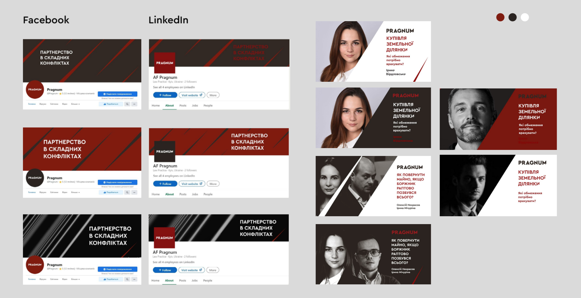
At the heart of the brand's graphics is a sharp line, a stylised sword mark.
Developing a new website
After updating our brand identity, we began working on a new website, as the previous one no longer met contemporary requirements and did not reflect the uniqueness of which Pragnum is the bearer.
The task was to:
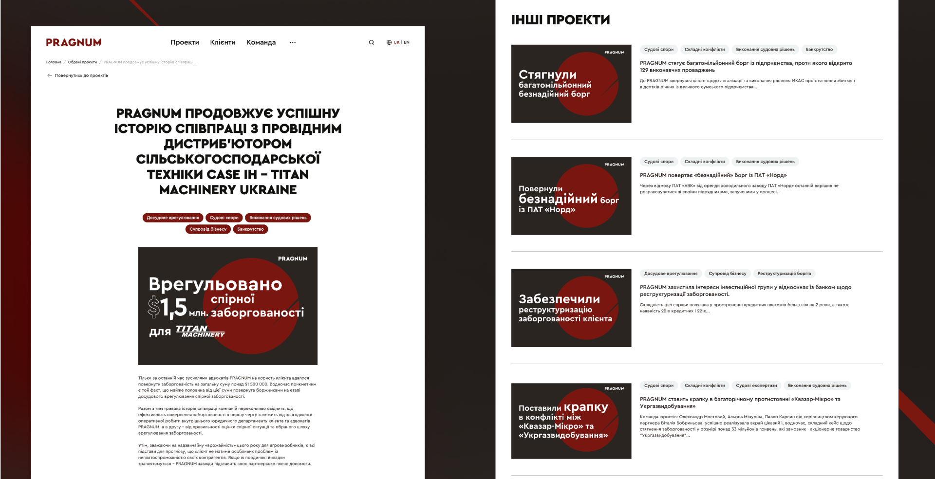
- Create a platform that not only looked modern, but also highlighted the company's core activity—client projects;
- Integrate the bold and non-standard new branding into the website in a way that kept it sleek and free from unnecessary elements. After all, the legal business still has its rules.
The solution was a website design in a restrained and elegant graphic style, using expressive typography and motion design—perfectly conveying the speed and precision of a Samurai sword.
The client's key requirements—to reflect the spirit of Pragnum, maintain simplicity and clarity, and ensure ease of use—were fulfilled 100%.
We created a platform that stands out among legal firms with its bold yet minimalist design, combining technical marketing capabilities with an unusual structure for this sector, focused around client projects.
Outcome
In the new brand identity and website, we have captured the essence and core mission of the company, which balances experience, expertise, and audacity with a commitment to customers and a willingness to win. And we hope this is just the beginning of our work with Pragnum.